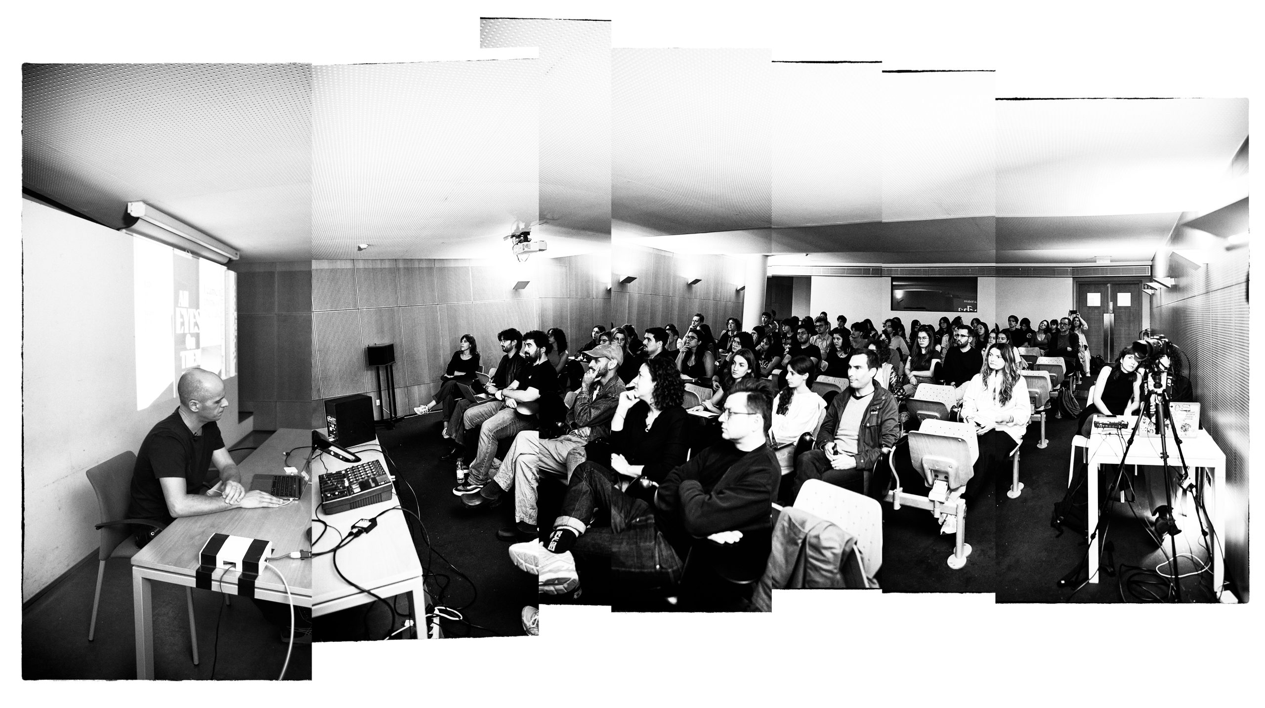
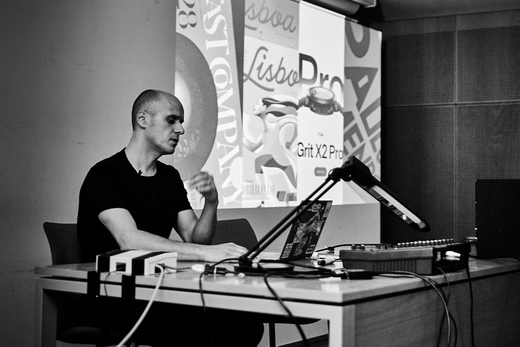
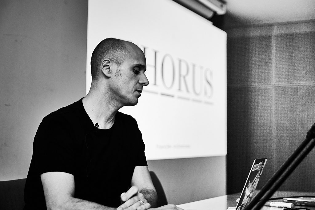
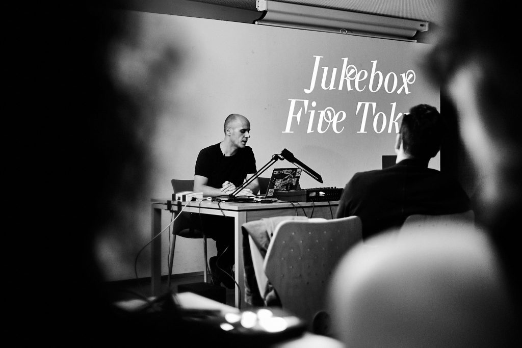
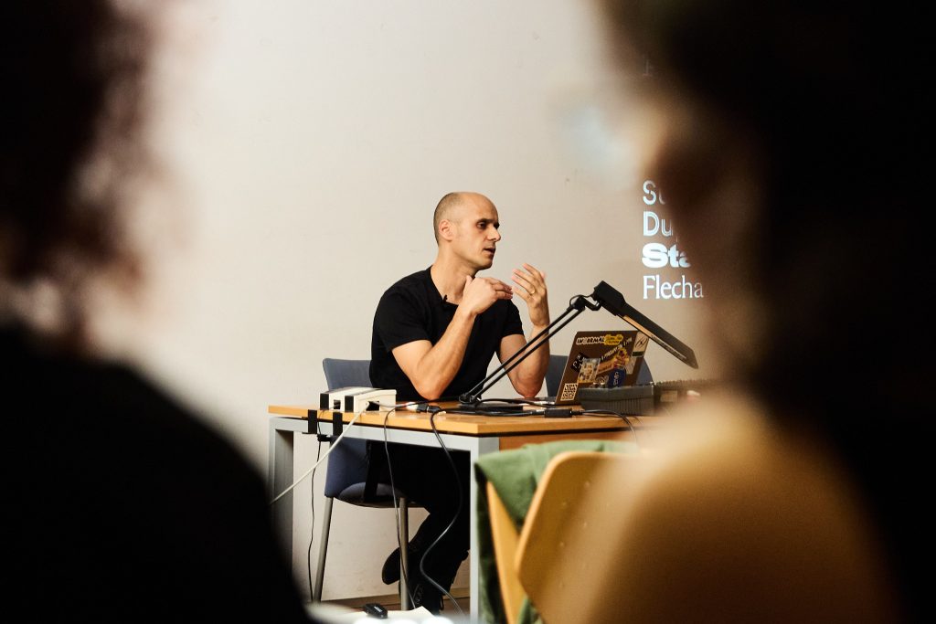
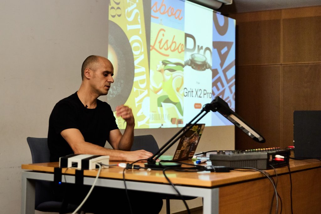
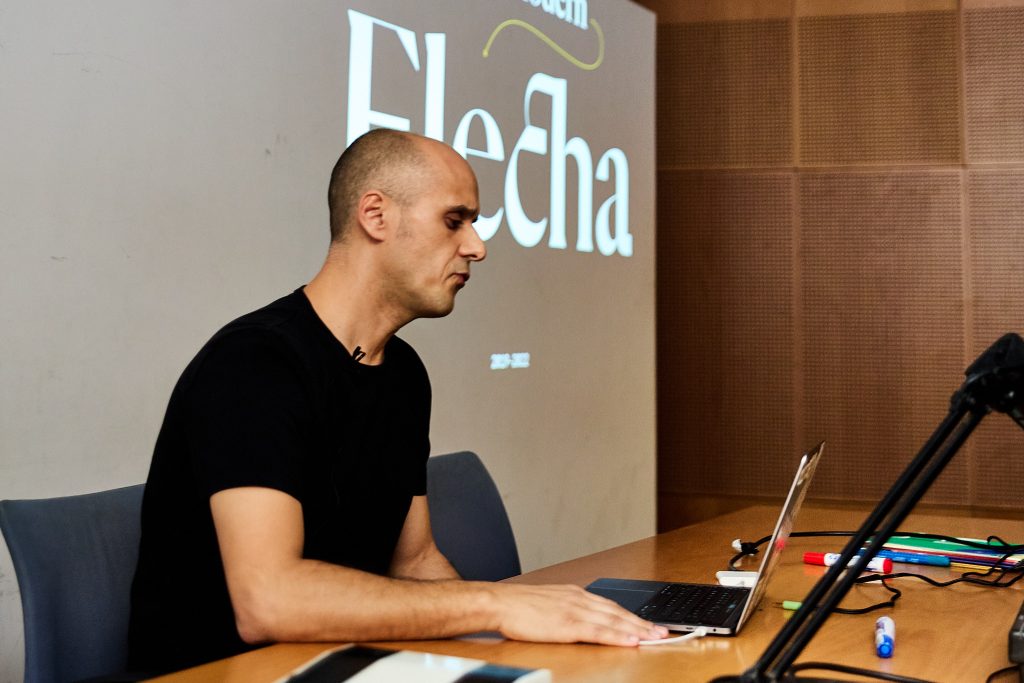
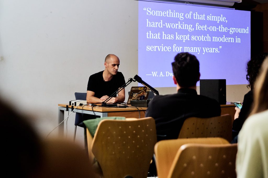
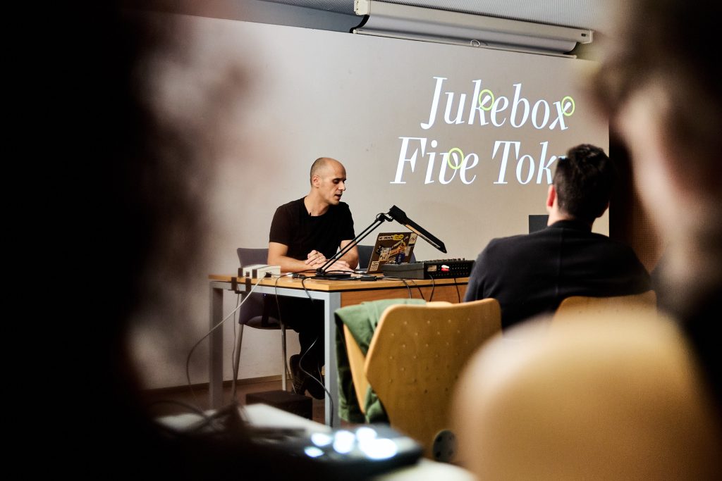
On a crisp afternoon at the PS01 Auditorium of FBAUP, Rui Abreu, one of Portugal’s most celebrated type designers, delivered a captivating masterclass titled “Living Lines”.
Hosted by the Communication Design Bachelor and with support from the i2ADS research unit, the session offered a deep dive into Rui’s design philosophies, his type foundry’s work, and the intricate craft of type design.
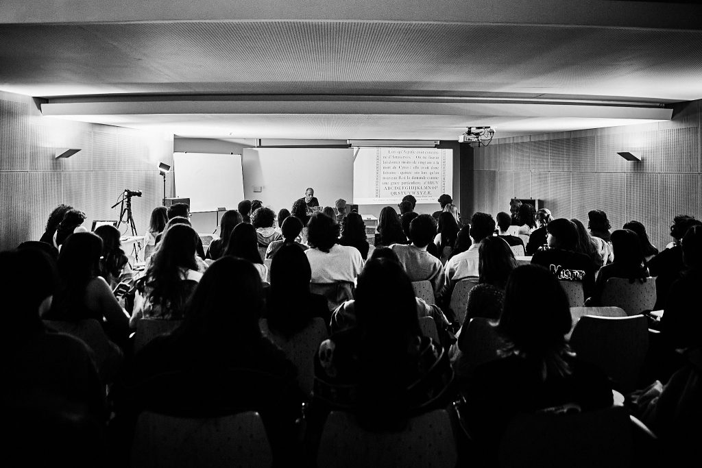
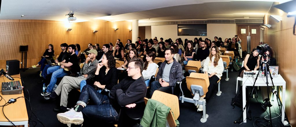
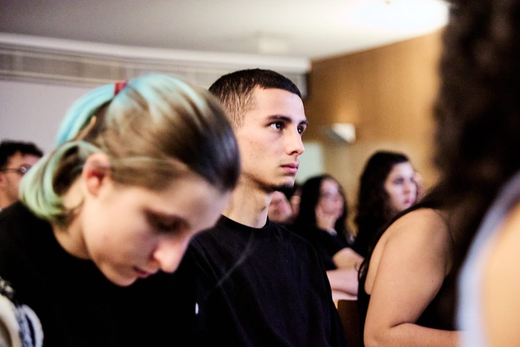
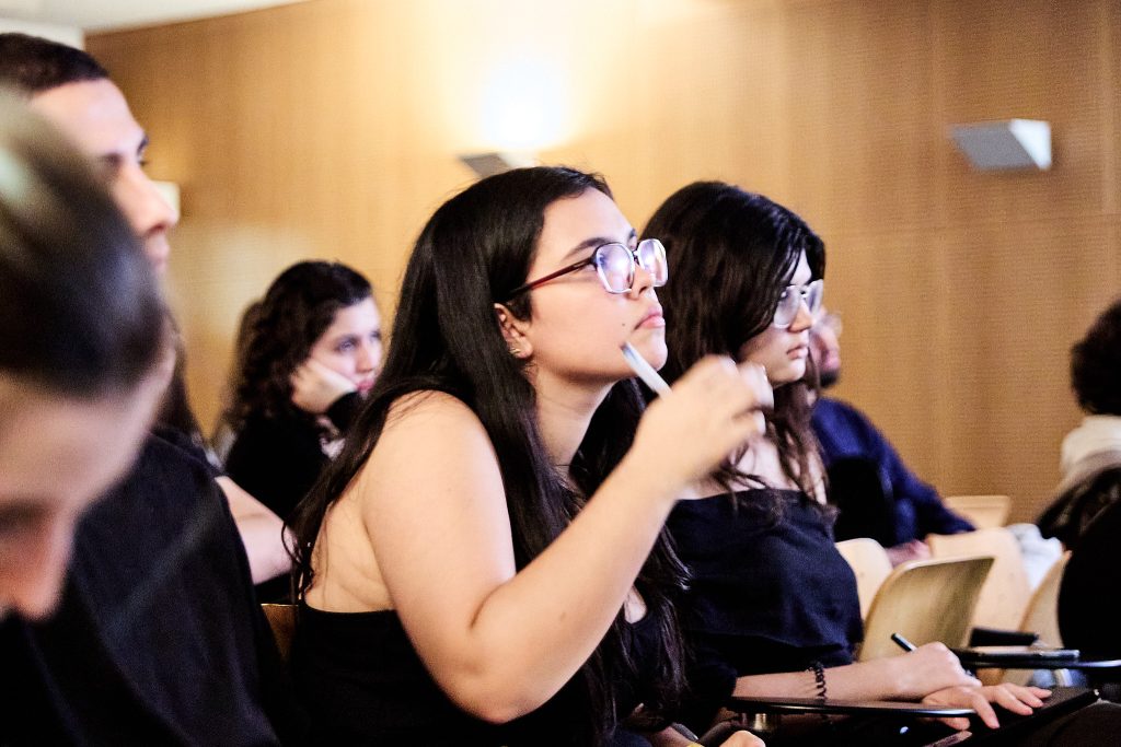
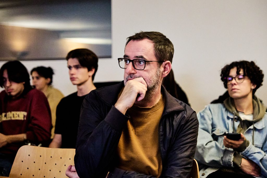
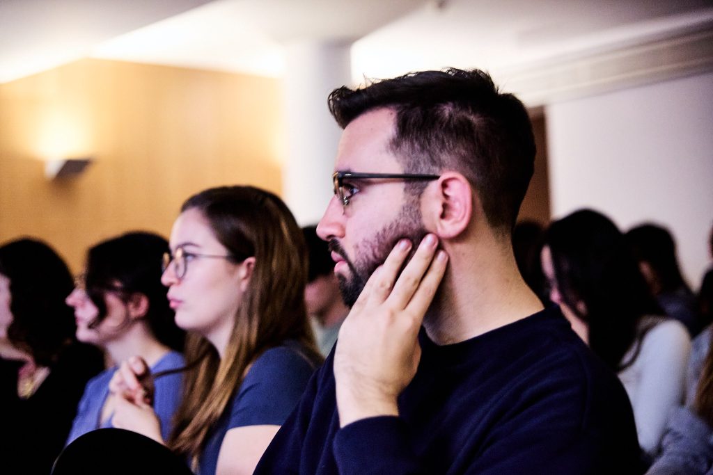
The event drew a vibrant and diverse audience of 66 attendees, including a group of 1st to 4th year Bachelor in Design students, a group of Master in Design and Editorial Projects students, a couple of FBAUP alumni, and even a visiting group from Universidade Lusófona, led by their teacher Igor Ramos.
The masterclass also attracted prominent names in type and graphic design, such as Kai Bernau (attending alongside our colleague Susana Carvalho), Diogo Rapazote, and Rui Duarte, underscoring the session’s importance and relevance to the broader design community.
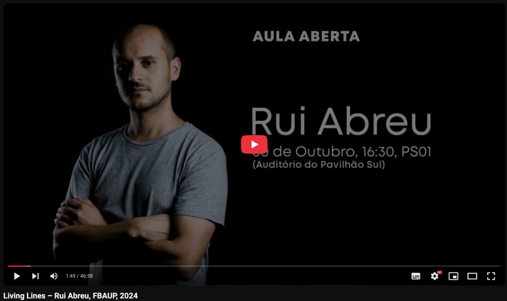
If you missed the event, you can watch the full conference online on the i2ADS YouTube channel.
Introducing “Living Lines”
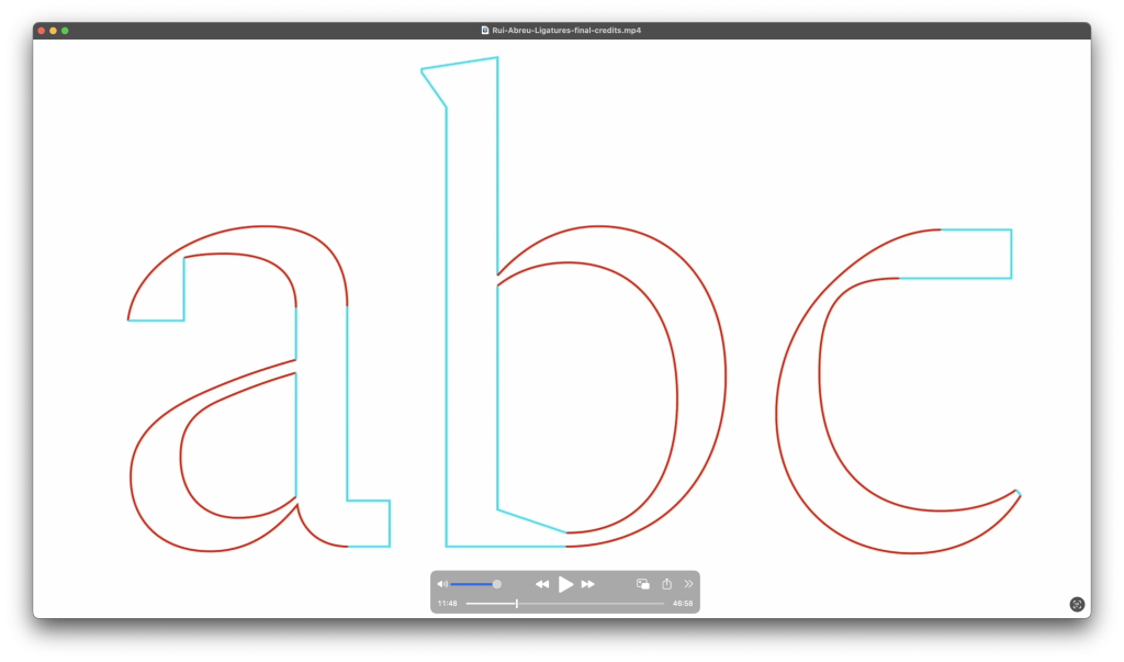
The title “Living Lines” encapsulates Rui’s approach to type design and his view of the interplay between straight and curved lines. Early in the session, Rui introduced the notion that straight lines, while precise and functional, are inherently “cold” and “dead,” whereas curves bring a sense of vitality and warmth. This dichotomy, as Rui explained, is at the heart of many of his creative decisions, from the historical revivals he undertakes to his experiments with original designs.
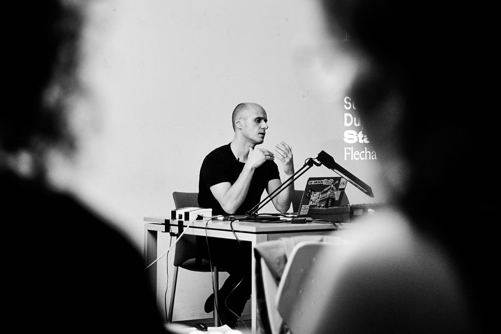
This was extracted from a quote that is particularly significant as it encapsulates Rui Abreu’s design philosophy and sheds light on the conference title, “Living Lines”. The quote reveals Abreu’s strong preference for curves, which he views as dynamic, expressive, and full of life. This perspective suggests that the title “Living Lines” stems directly from Abreu’s own words and represents his core belief in the power of curves to create engaging and visually appealing typefaces.
Throughout the conversation, we saw how Rui Abreu emphasized the interplay of curves and straight lines in his work. He views this dynamic relationship as essential to achieving visual harmony and appeal in his typefaces.
…Quero dizer que as curvas são quentes e vivas e em contraponto as retas são mortas.
This translates to: “… the curves are warm and alive, and in contrast, straight lines are dead.”
This theme resonates strongly with the mission of i2ADS’s Ligatures research initiative, which explores the dynamic interplay between tradition and innovation in typography. Rui’s work exemplifies how history and originality can coexist, enriching the field with designs that are both timeless and forward-thinking.
The Philosophy: History and Originality
For Rui, type design is a balancing act between honoring historical precedents and pushing the boundaries of originality. He sees historical models not as constraints but as springboards for innovation. “To break free from the past, you must first understand it,” he explained, highlighting the importance of studying typefaces from previous centuries while finding ways to make them relevant today.
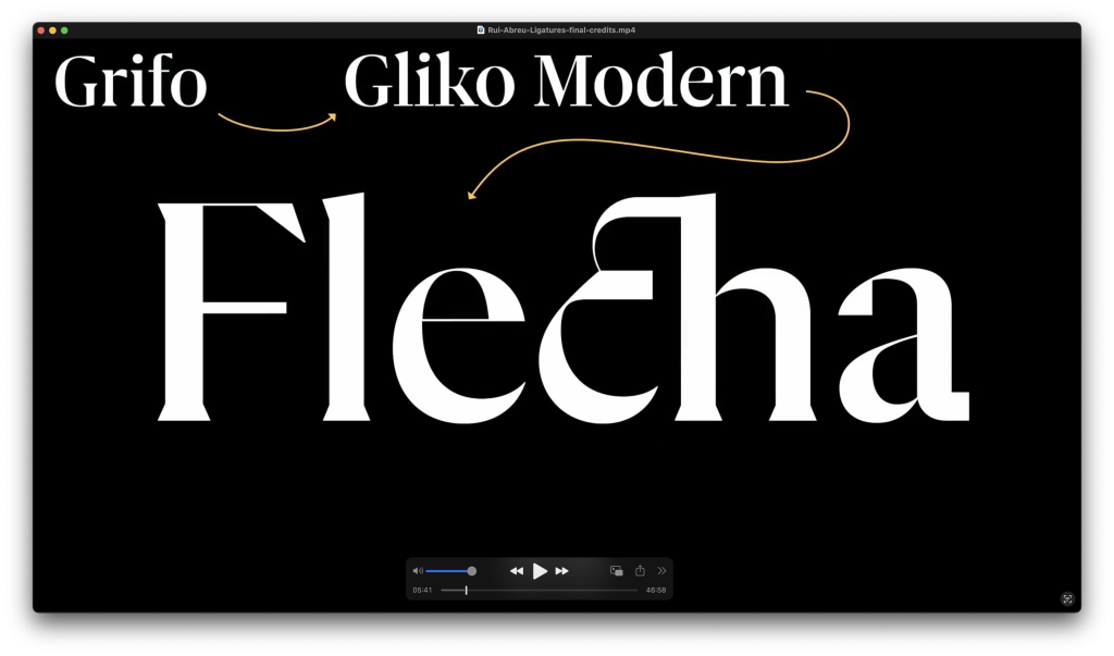
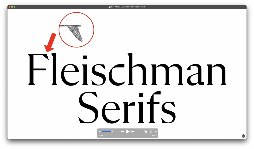
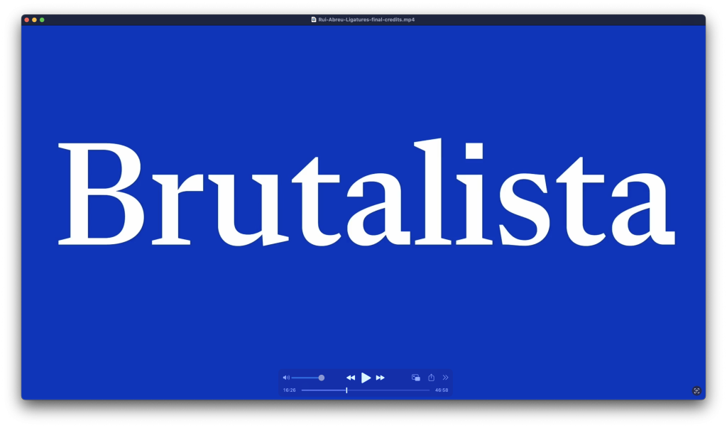
One example he shared was his typeface Flecha.
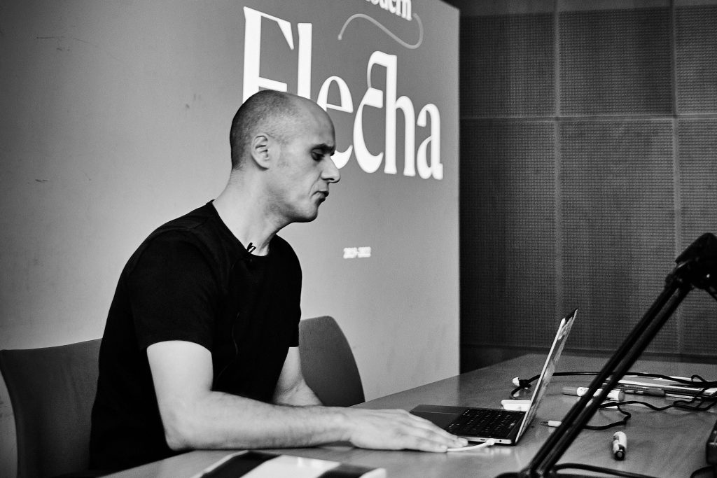
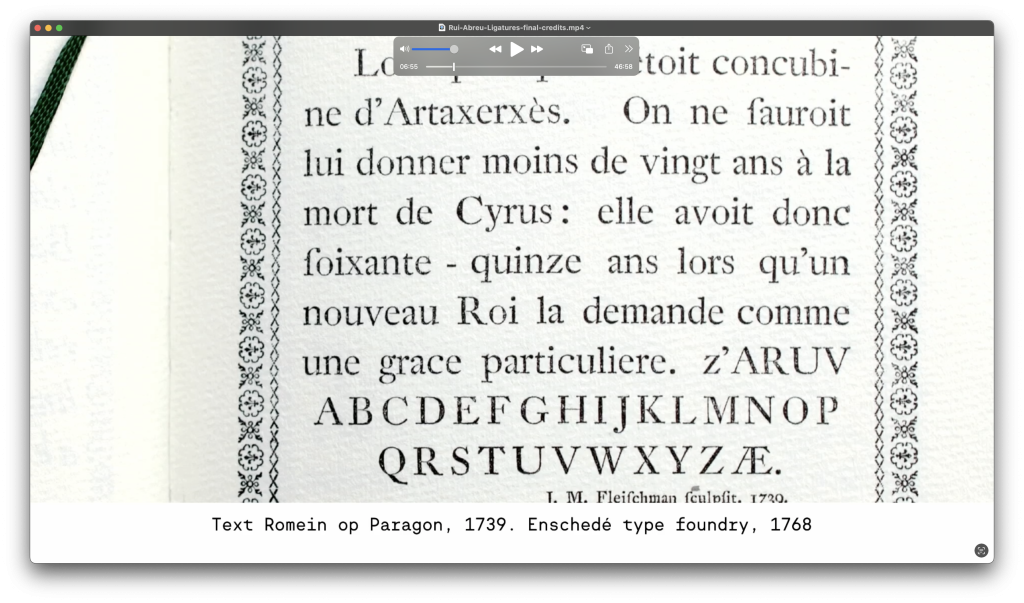
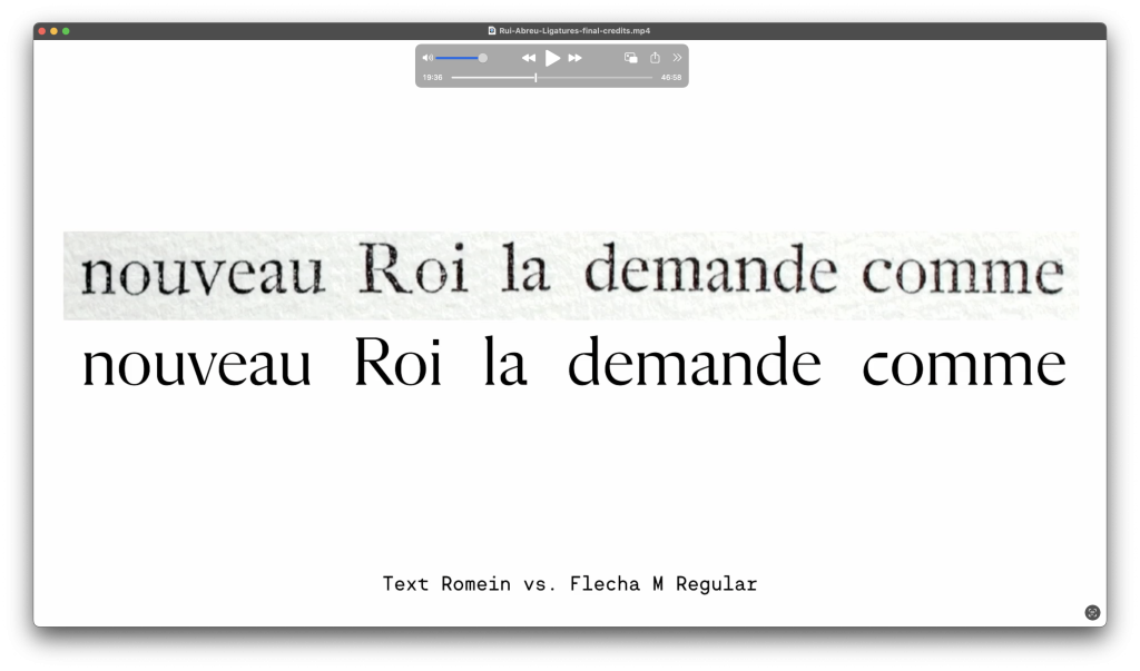
Rooted in the Baroque typographic traditions of the 18th century, it draws inspiration from Fleischmann’s type but infuses it with contemporary rationality and simplicity. Flecha’s design journey showcases Rui’s process of synthesizing historical influences with bold, modern design choices, resulting in a typeface suitable for editorial use in magazines and books. This connection between history and novelty aligns closely with his dedication to research that bridges the old and new.
Flecha
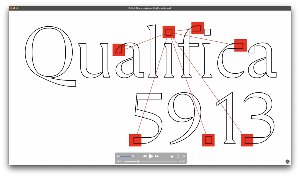
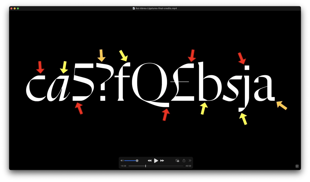
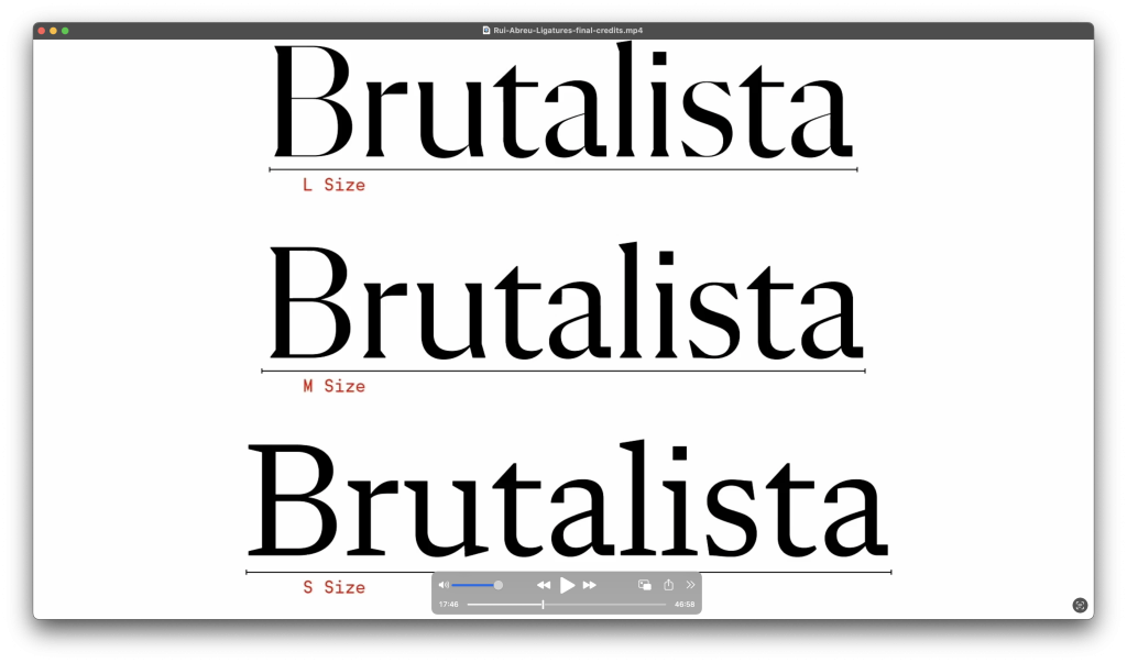
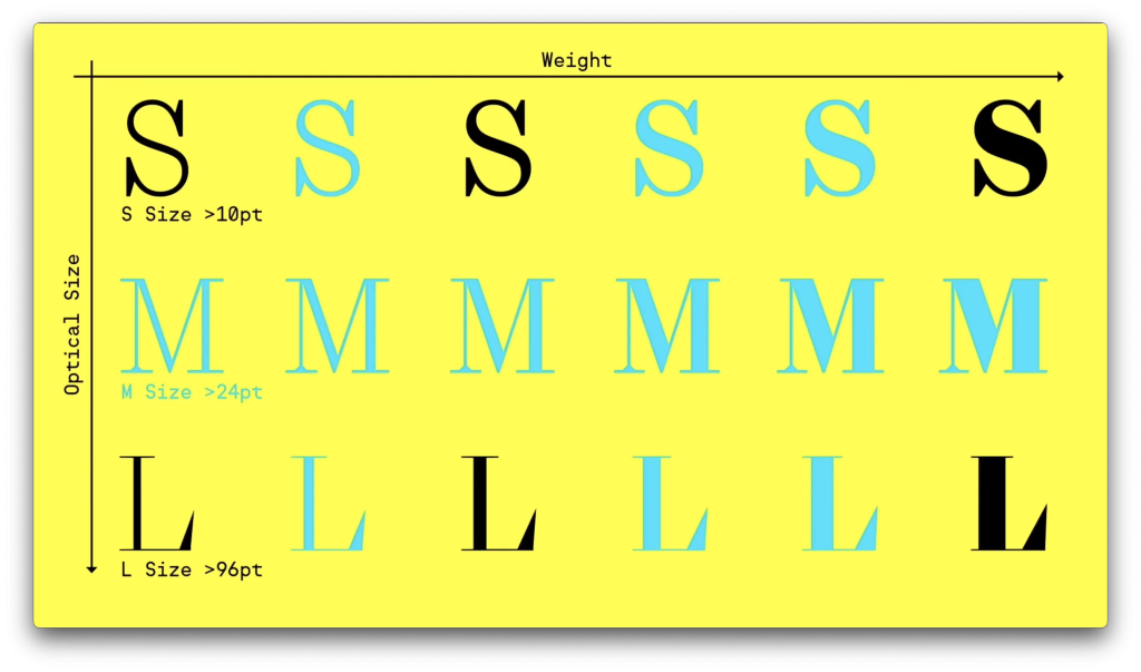
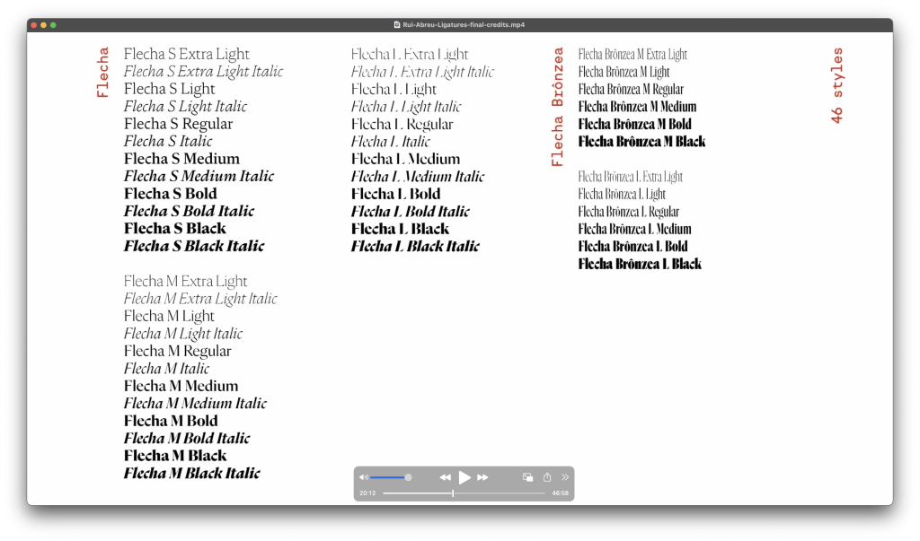
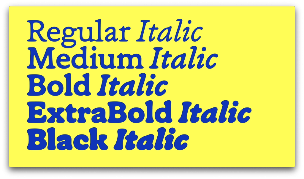
Flecha took one of the first center stages during Rui’s presentation. First launched in 2019, the typeface evolved over three years, with Rui gradually adding styles and features. Designed with optical sizes in mind, Flecha caters to a variety of uses, from bold titles to small text. Rui explained the importance of optical adjustments, where characters are tailored to ensure legibility and harmony across different sizes.
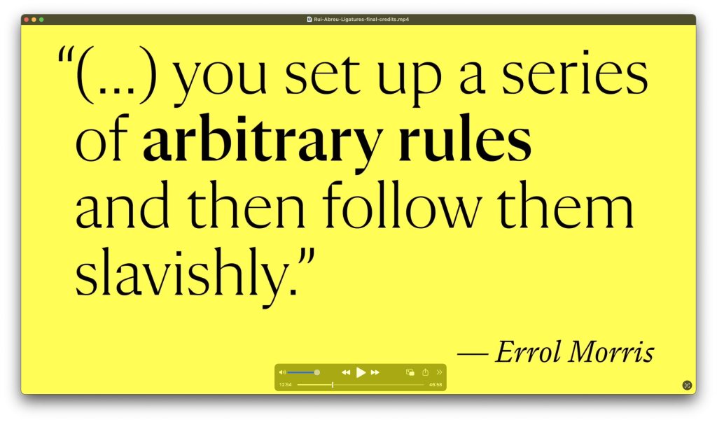
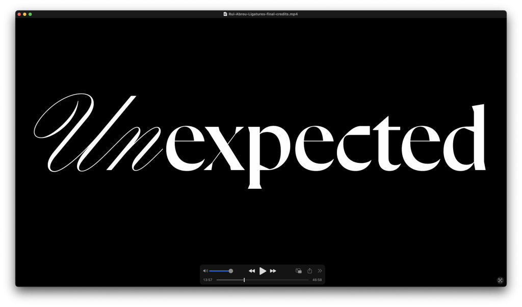
The design process involved what Rui described as “arbitrary rules”—like replacing round dots with square ones—to explore new visual effects while maintaining consistency across the alphabet. These self-imposed constraints, he said, often spark unexpected creativity, resulting in typefaces with distinct personalities.
Flecha exemplifies Rui’s ability to blend the geometric with the organic, offering designers a tool that’s both highly functional and visually striking. Its use in magazines, books, and branding projects demonstrates its versatility and appeal.
From the past to the present work
Rui also walked us through several other typefaces from R-Typography’s portfolio, each with its unique story:
Montris
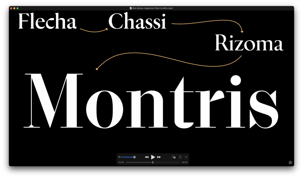
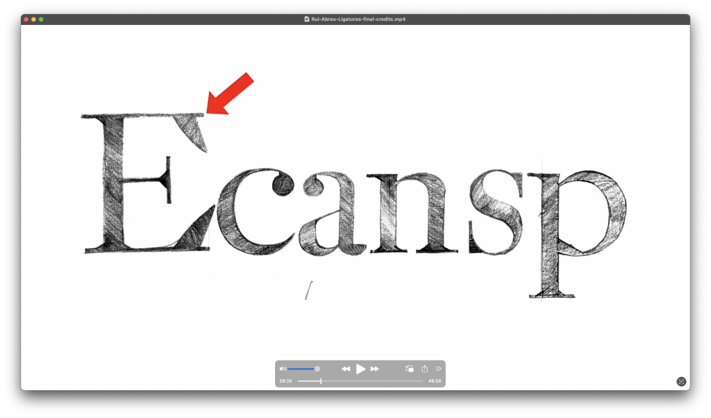
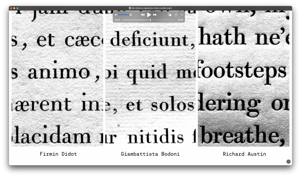
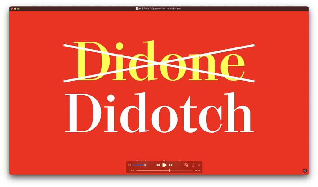
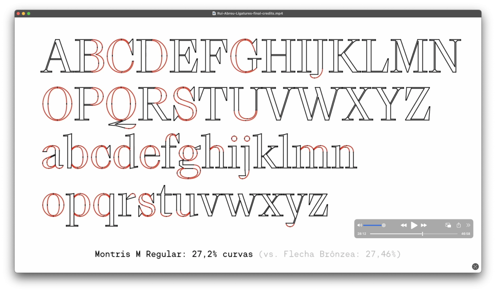
A modern take on neoclassical typefaces, Montris reflects the influence of Didot and Bodoni but leans toward simplicity and functionality, making it ideal for book design. Rui highlighted how he balanced extreme contrast with softer, balanced curve-to-straight lines ratio, more practical features for better usability.
Chassis
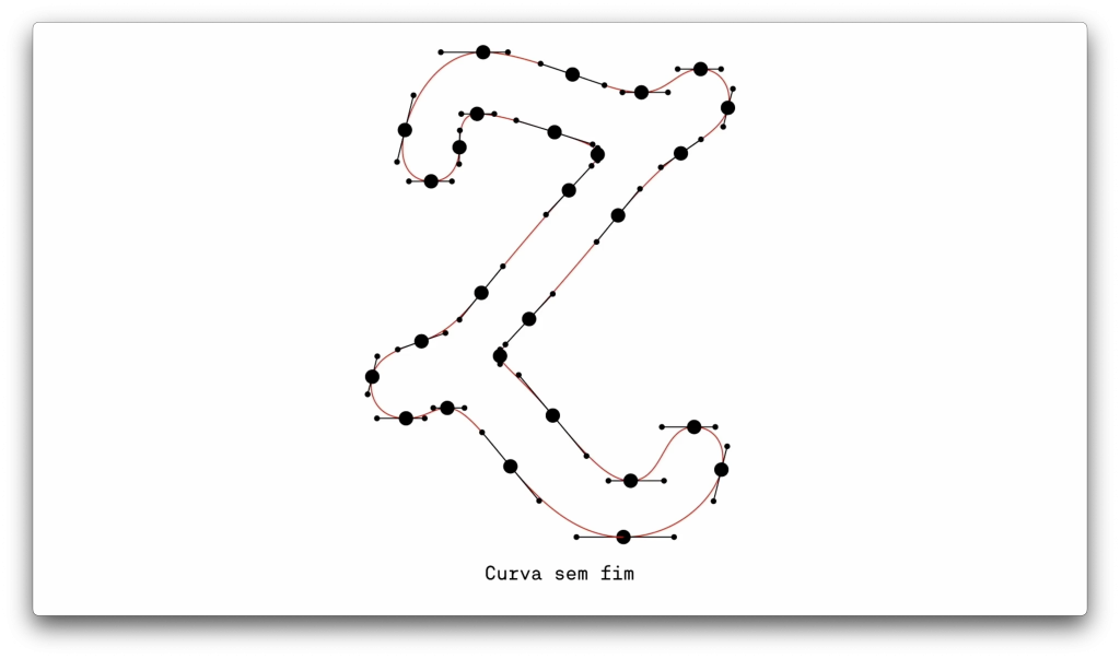
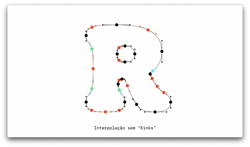
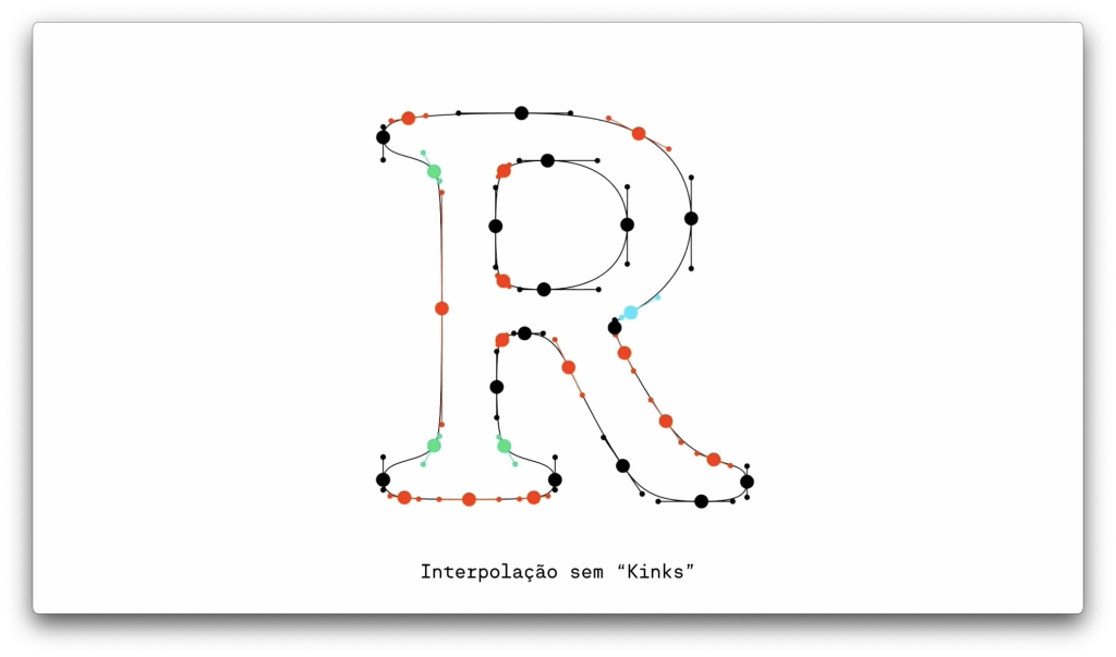
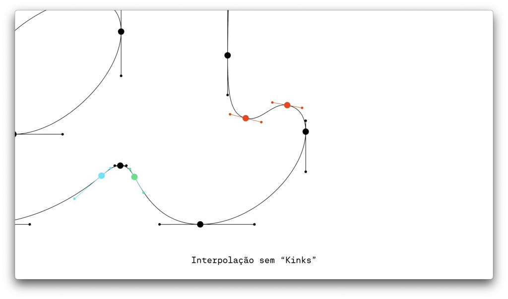
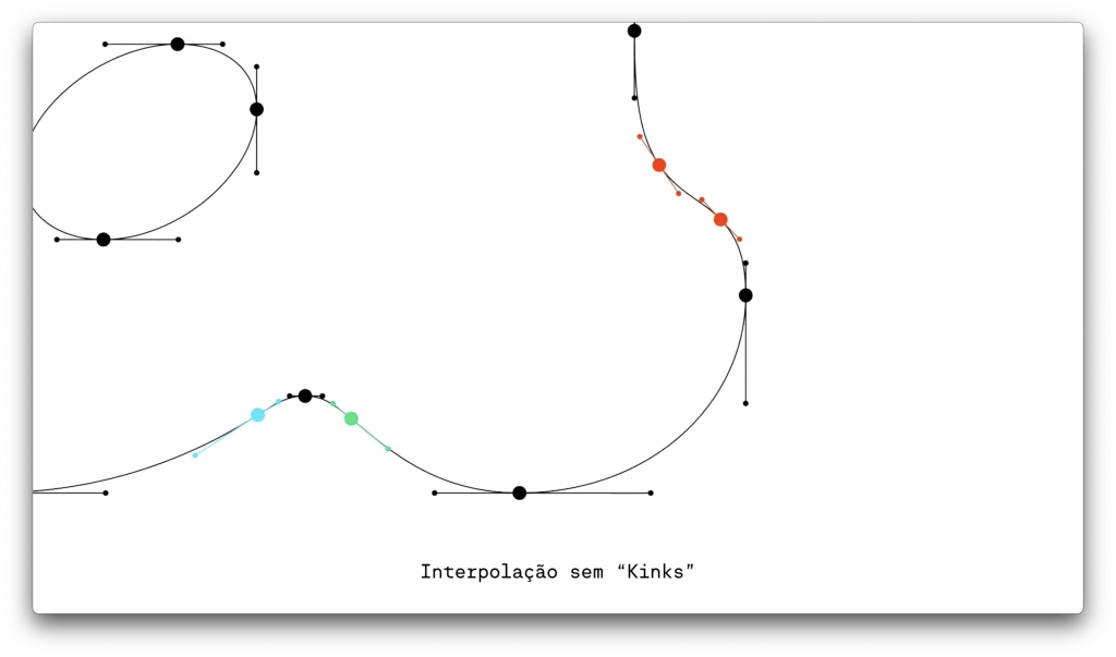
An exercise in maximal curves, Chassis is an entirely curved typeface, breaking away from rigid structures to create something fluid and expressive. Rui compared its endless curves to the continuous flow of a ribbon, emphasizing the technical challenges of achieving smooth interpolation in such designs.
Flecha Brônzea
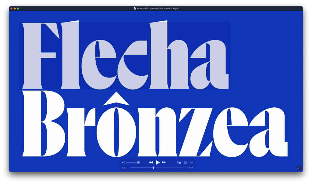
A condensed variation of Flecha, designed to expand its applications. Rui shared how he used interpolation to develop Flecha Bronze while maintaining its sharp, angular aesthetic.
Orbe
Rui’s award-winning blackletter-inspired (Lombardic?) typeface, which garnered a Type Directors Club Certificate of Excellence in 2008, represents his deep respect for typographic tradition combined with a contemporary twist.
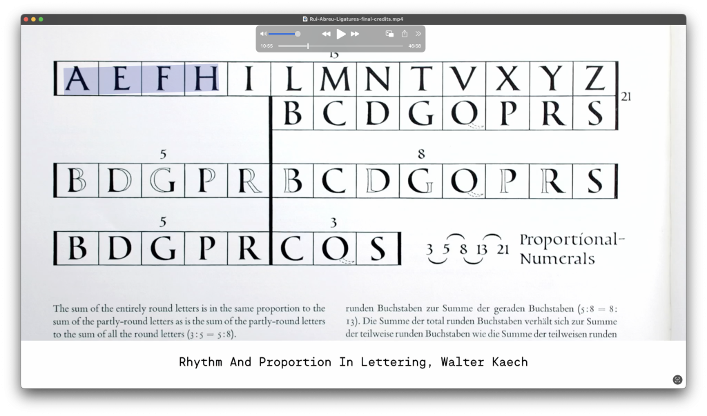
Each of these typefaces, Rui explained, is born from a deep exploration of geometry, proportion, and the interplay of straight and curved lines. His meticulous design process—often involving multiple masters for interpolation—underscores his commitment to creating tools that serve designers across diverse contexts.
Rambóia
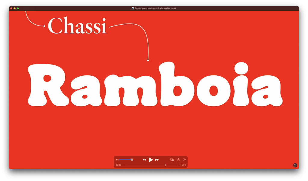
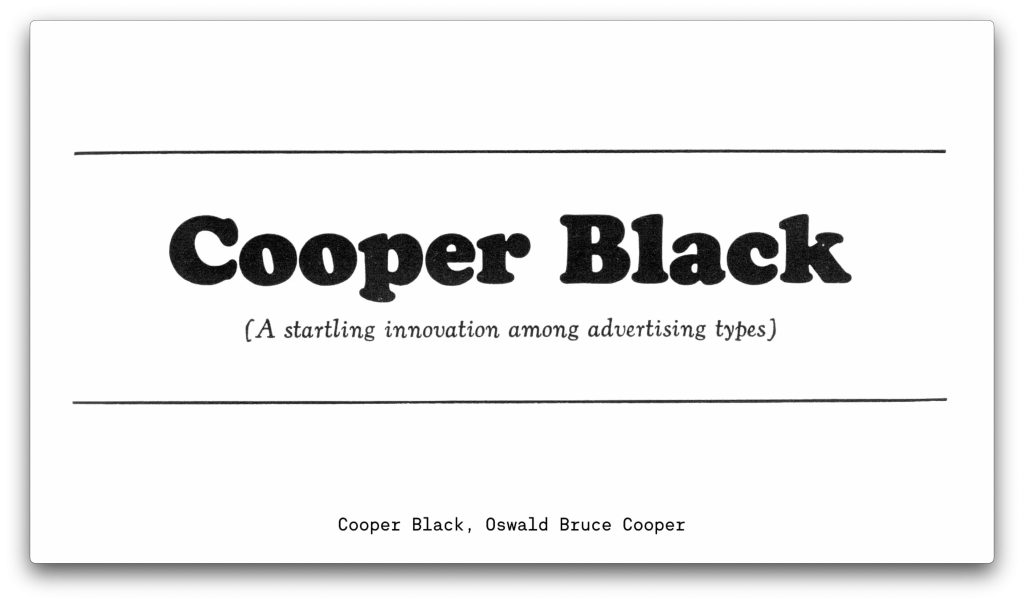
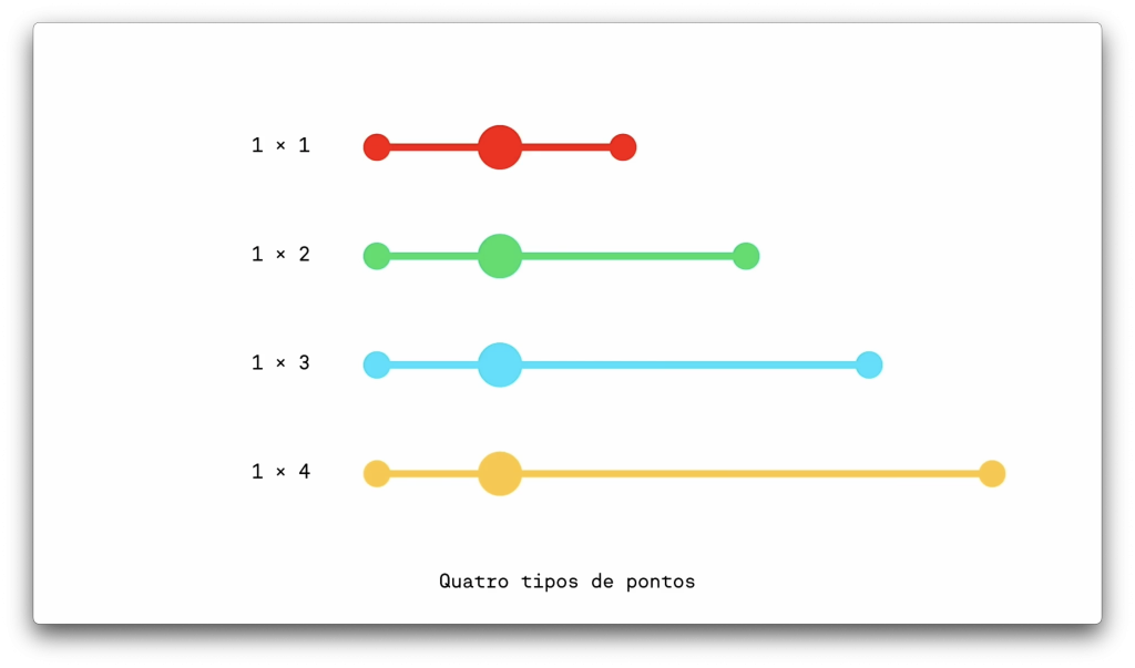
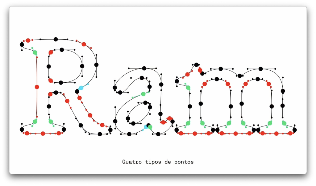
He most spectacularly ended the conference by presenting a 180º philosophy revolution by presenting his latest work in progress — Rambóia. A warm and friendly disruptive curve-only typeface design 😉
A Balancing Act: Between History and Originality
For Rui Abreu, designing typefaces is all about balance—respecting the past while carving out his own creative path. He sees historical typefaces not as templates to copy but as treasure troves of inspiration. By dissecting their structure, proportions, and quirks, he extracts lessons from the masters. Then, he takes those ideas and runs with them, blending tradition with his own fresh perspective.
Take Flecha, for instance. While inspired by a German engraver’s work, Rui didn’t just mimic the historical design. Instead, he introduced bold, modern elements like square dots, giving it a crisp, contemporary vibe. Similarly, Montris nods to the neoclassical elegance of Didot and Bodoni but swaps rigid perfection for a more functional, everyday charm.
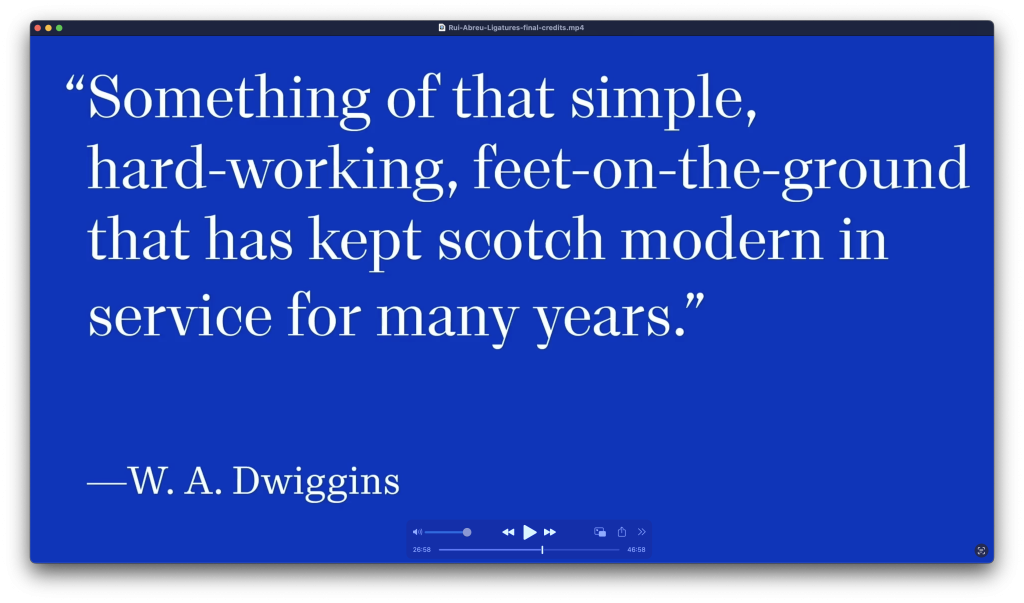
For Rui, historical knowledge is a must-have for any type designer. He believes that understanding how letterforms evolved helps designers solve problems and make smarter, more intentional choices. But here’s the key: he’s careful not to lean too heavily on the past. History is a guide, not a straightjacket.
“It’s a bit difficult to do something completely detached from these models,” Rui admits. And he’s fine with that. History influences his work, but it doesn’t limit his creativity. Instead, it fuels his constant “search for a personal language,” where tradition and innovation meet. His ultimate goal? To create typefaces that feel both rooted and original—designs that honor the legacy of typography while bringing something new to the table.
Contrasting Designs: Flecha’s Geometry vs. Rambóia’s Fluidity
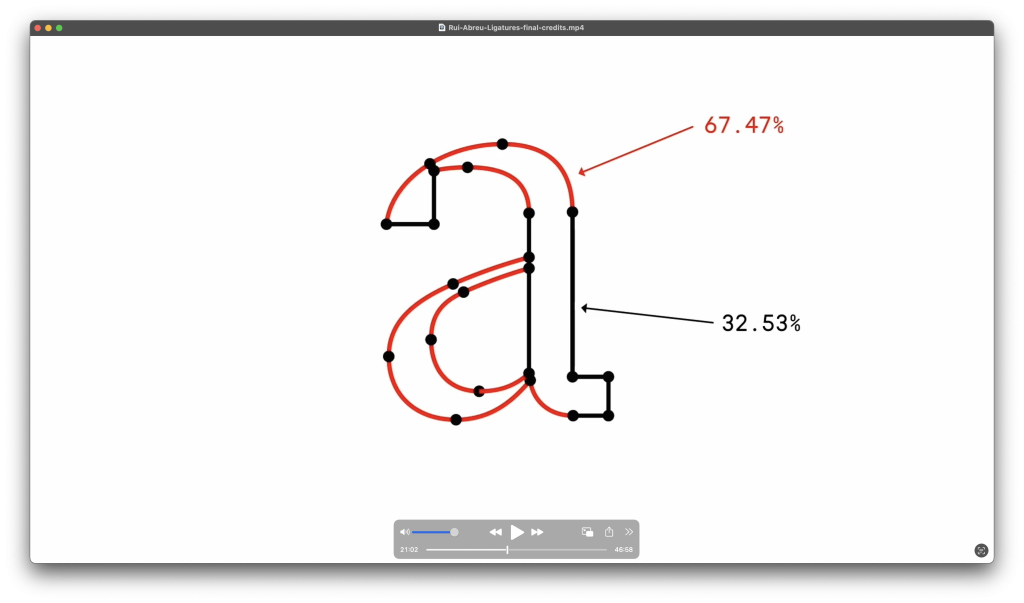
Flecha stands out for its sharp, geometric precision, characterized by angular shapes, straight lines, and a sense of order that Rui Abreu describes as “brutalist.” Square dots replace traditional rounded terminals, and the deliberate use of straight lines creates a structured, rational aesthetic. Rui playfully notes that Flecha is “two-thirds dead,” referring to the prevalence of straight lines, which he associates with coldness and rigidity.
In contrast, Rambóia takes an entirely different approach. Built exclusively with curves, it exudes softness, warmth, and fluidity. Rui describes it as “all living lines,” emphasizing the vitality that curves bring to type design. The challenge with Rambóia was ensuring seamless transitions between its flowing contours, requiring meticulous control of digital points to maintain its dynamic, almost handwritten quality.
While both typefaces reflect Rui’s mastery of historical references and thoughtful design, they diverge fundamentally in their visual language: Flecha is geometric and structured, while Rambóia celebrates organic movement and continuous flow.
Learning from the Past to Design the Future
For Rui Abreu, history isn’t just a dusty archive—it’s the ultimate toolbox for type design. He sees historical typefaces as a vital foundation for creating original, meaningful work today. But don’t mistake his approach for copying. Rui doesn’t just replicate old typefaces; he studies their inner workings—the structure, proportions, and quirky details—to unlock the logic behind them. Then, like a typographic alchemist, he reimagines those ideas in a modern context.
Take Flecha, for example. Inspired by Johann Michael Fleischmann’s Baroque-era type, Rui used its historical DNA to craft something contemporary and fresh. Or Montris, where he riffed on the neoclassical elegance of Didot and Bodoni, blending their high contrast with a more grounded and functional aesthetic.
Rui believes that understanding the evolution of letterforms and typographic conventions helps designers make smarter choices. “In typography, there’s always history,” he says. “It doesn’t mean you have to be academic all the time, but when you realize something fits into a historical period or style, you naturally get involved with those models.”
But here’s the twist: Rui doesn’t just stay in the past. He emphasizes the need to strike a balance—using historical models as a springboard, not a crutch. For him, type design is a constant search for a personal voice. Historical references are guideposts, but they also challenge him to explore new directions and push boundaries.
Rui’s philosophy boils down to this: study the masters, learn the rules, and then make them your own. By understanding the past, designers can create typefaces that feel grounded yet original, timeless yet totally relevant. And isn’t that what great design is all about?
The Role of Technology
Rui didn’t shy away from discussing the impact of emerging font technologies like variable fonts. He demonstrated how variable axes, such as optical size adjustments, allow for a seamless user experience, where fonts adapt effortlessly to different sizes and contexts. Rui’s ability to integrate these technologies into his typefaces ensures that they remain cutting-edge, meeting the needs of modern designers.
The Human Element
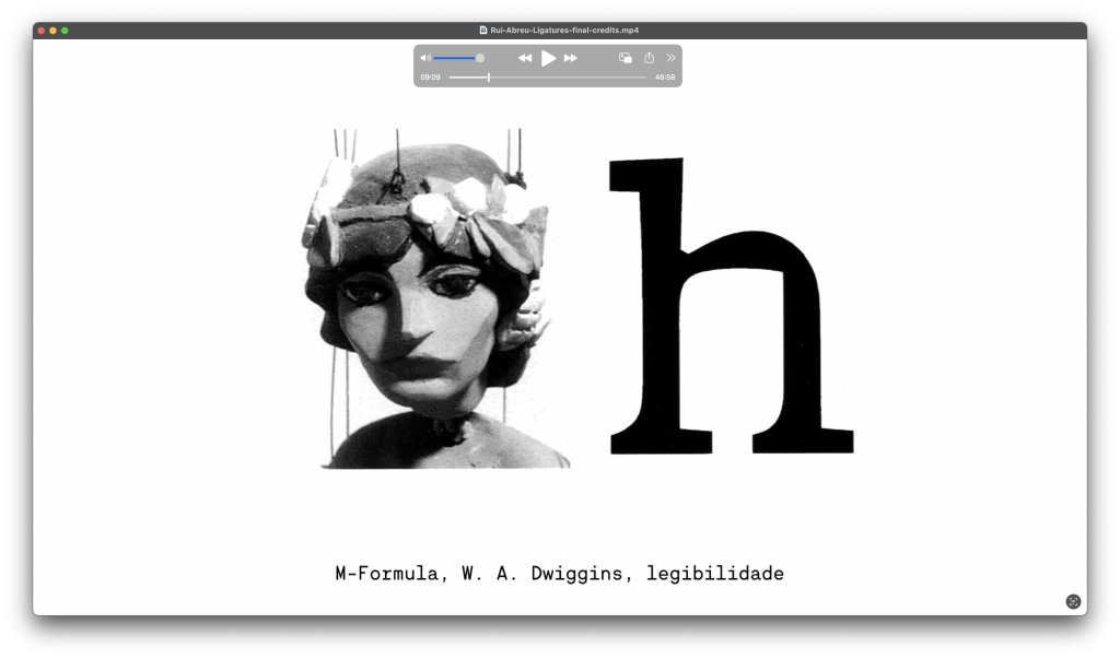
Beyond the technicalities, Rui’s presentation was a testament to the human element in type design. He described the long, iterative process of refining a typeface, often involving countless decisions about the tiniest details. It’s a labor of love, requiring patience and a willingness to embrace both the conventions and surprises of the craft.
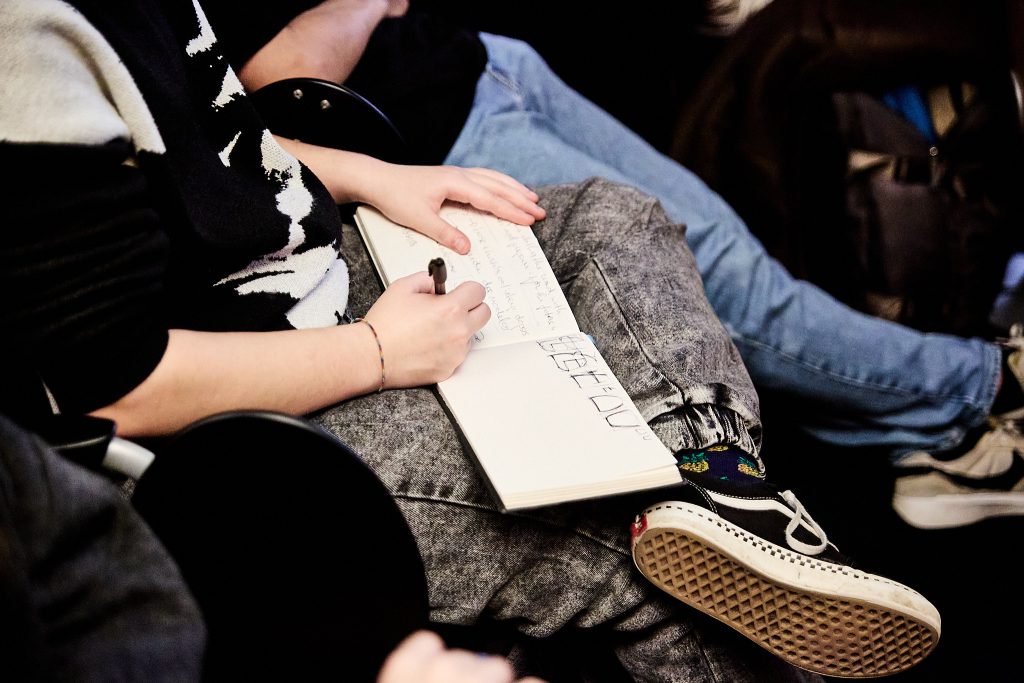
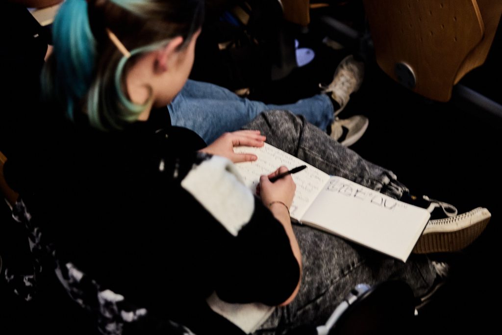
The Q&A session brought out Rui’s generosity and approachability, as he fielded a range of questions about his creative process, how he became a type designer, how he plans and deals with trends, clients and the foundry catalogue, and the future of typography in Portugal. Students were particularly inspired by his advice to embrace history as a tool for innovation and his emphasis on finding a personal voice in design.
Conclusion [AKA] Ligatures
Rui Abreu’s masterclass was more than a showcase of his work and important type design concepts addressed both in the bachelor’s and in the master’s degrees—it was a reflection of the values that drive the design-based research developed within Ligatures research initiative. By weaving together history, originality, and cutting-edge technology, Rui exemplifies the very essence of typography as a living, evolving art form.
For students and aspiring designers, his insights offered a glimpse into the rigorous yet deeply rewarding world of type design. And for all attendees, the session was a reminder of the power of typefaces to shape our visual culture, one living line at a time.
We look forward to seeing how Rui’s work continues to inspire new generations of designers—and to more events like this that bring together creativity, research, and a shared passion for design.
