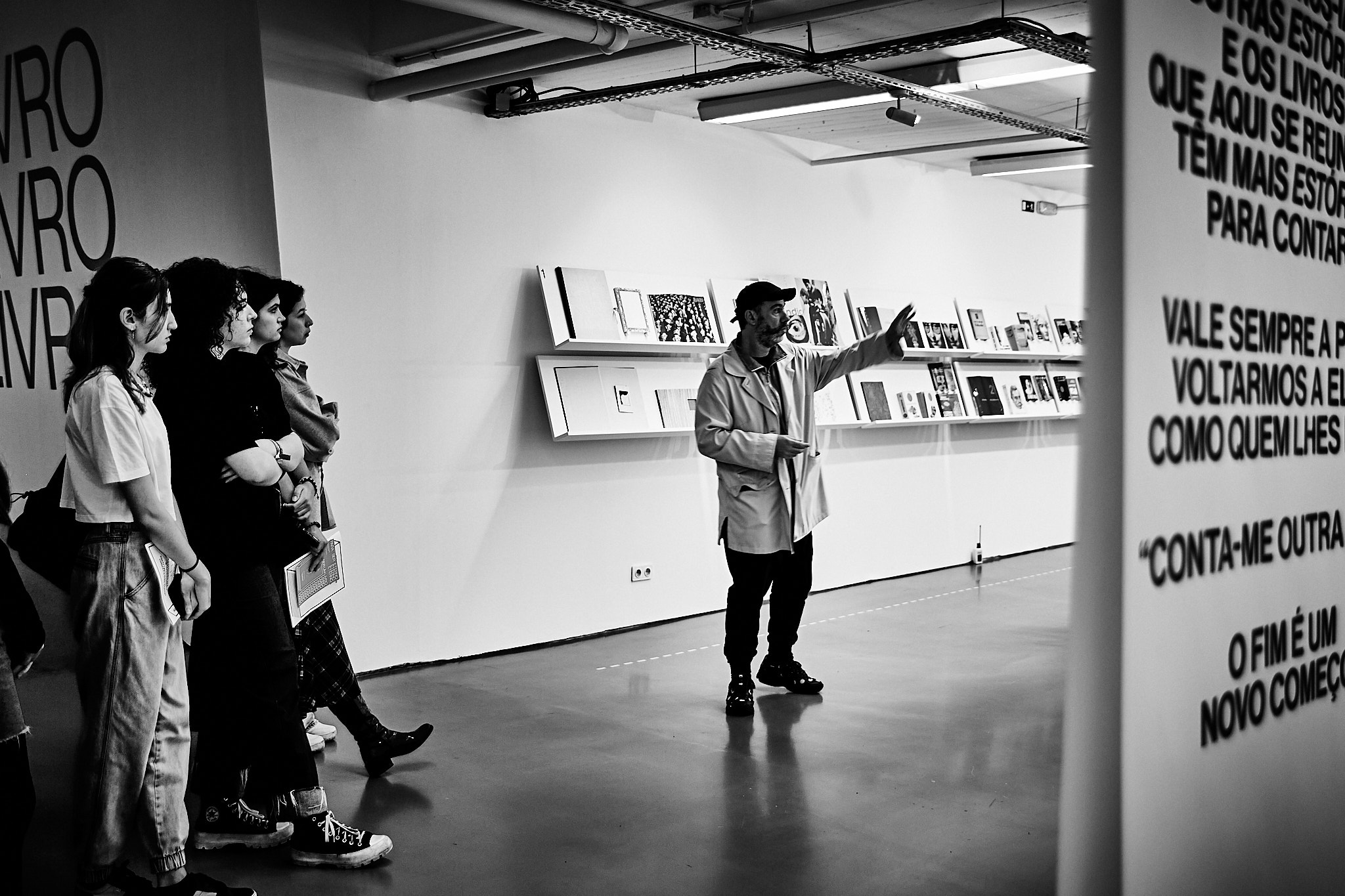
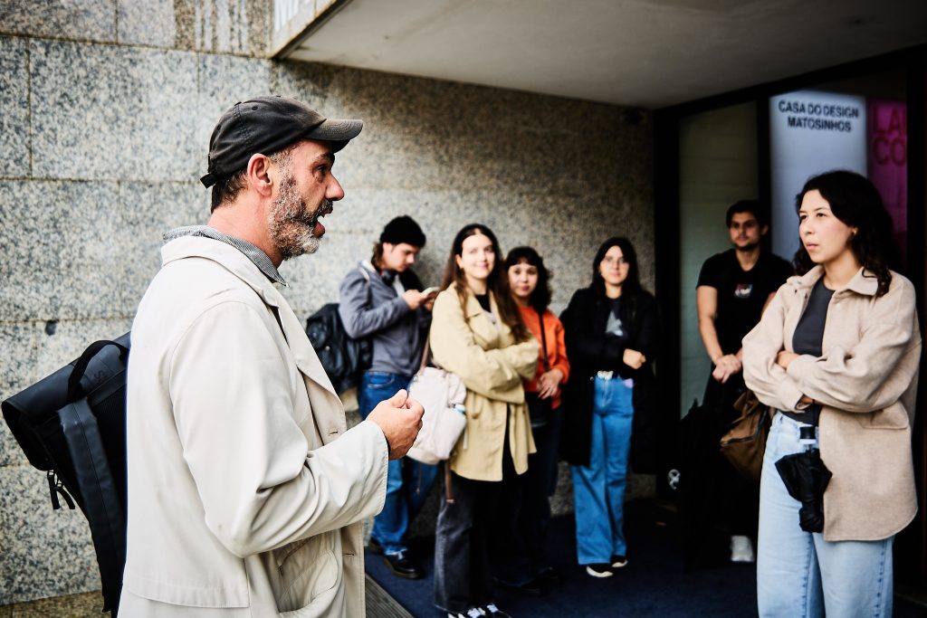
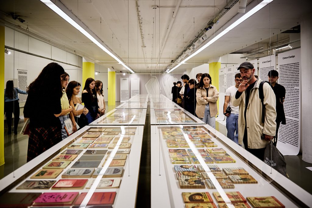
Last week, the Lettering and Type Drawing students from the Communication Design bachelor at FBAUP had an unforgettable experience visiting the exhibition “Para Ser Eterno Basta Ser Um Livro — Editorial e design do livro em Portugal no século XX” [To Be Eternal, a Book is Enough – Editorial and Book Design in Portugal in the 20th Century].
The exhibition is being held at Casa do Design in Matosinhos, and offers a deep dive into the Portuguese editorial and graphic world, spanning the entire last century, and highlights books as both cultural artifacts and design objects.
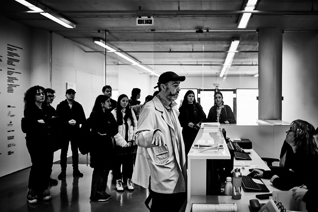
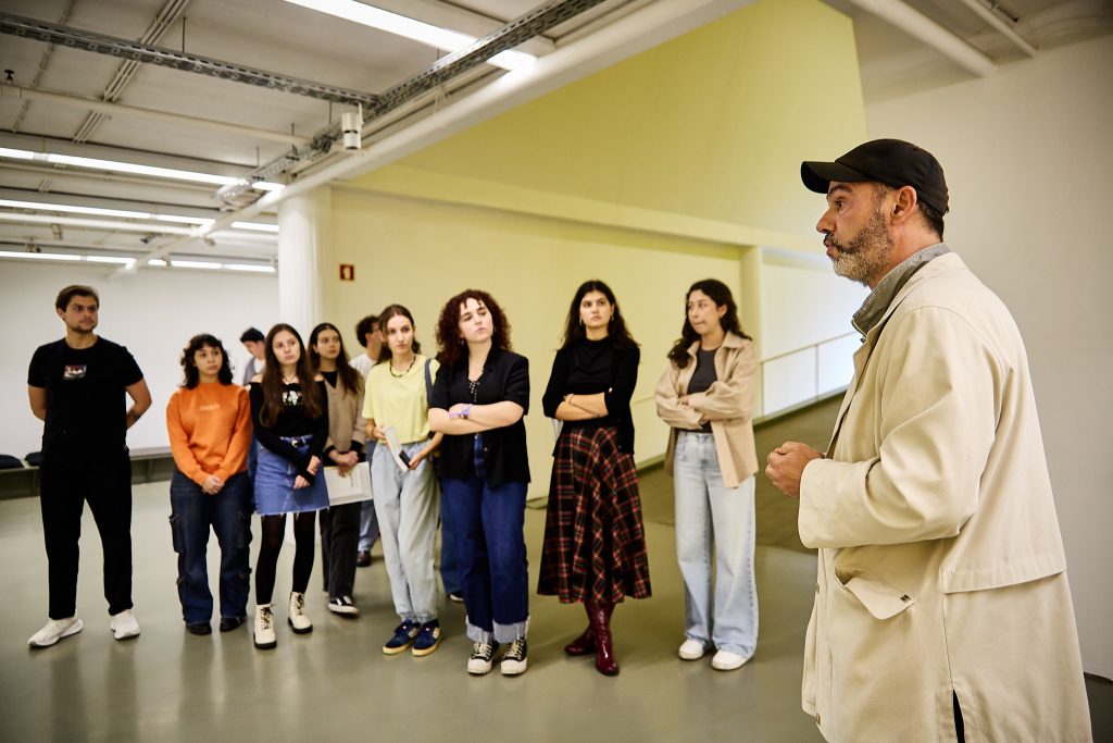
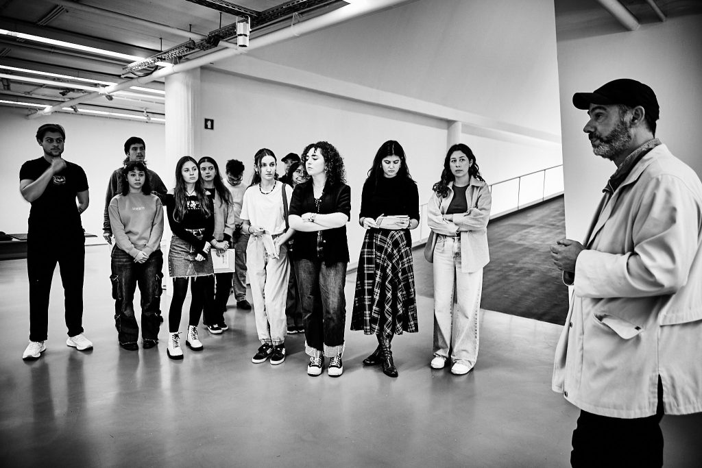
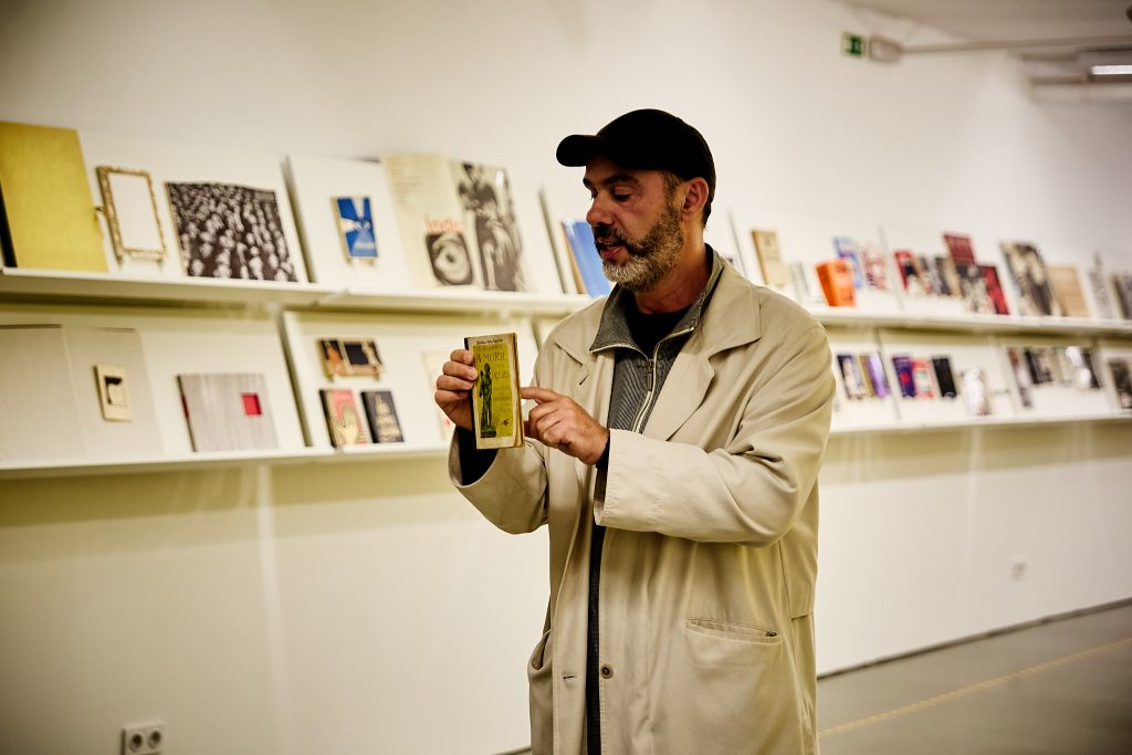
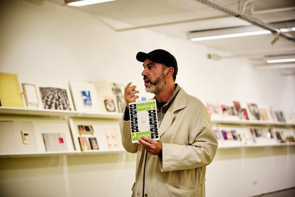
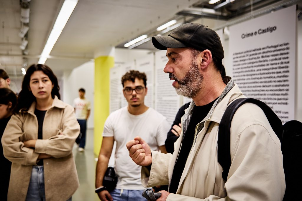
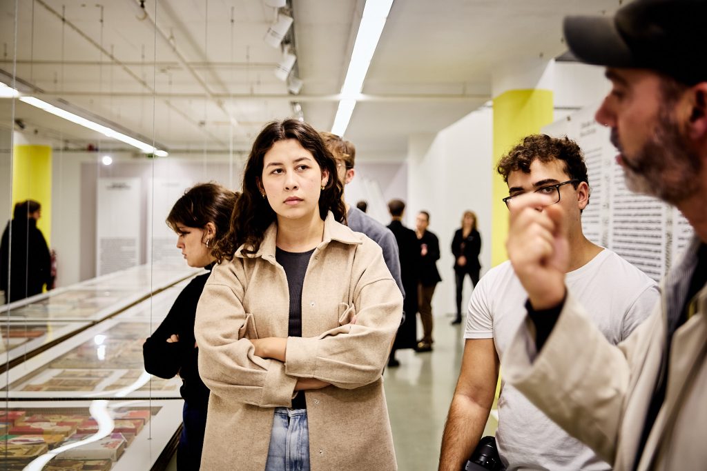
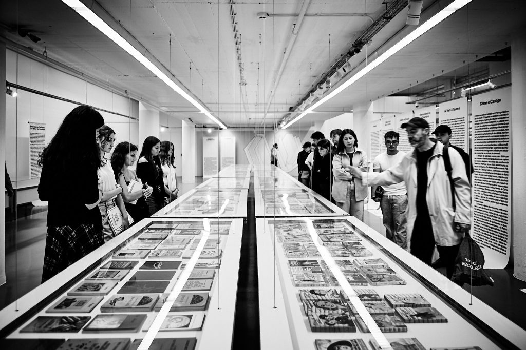
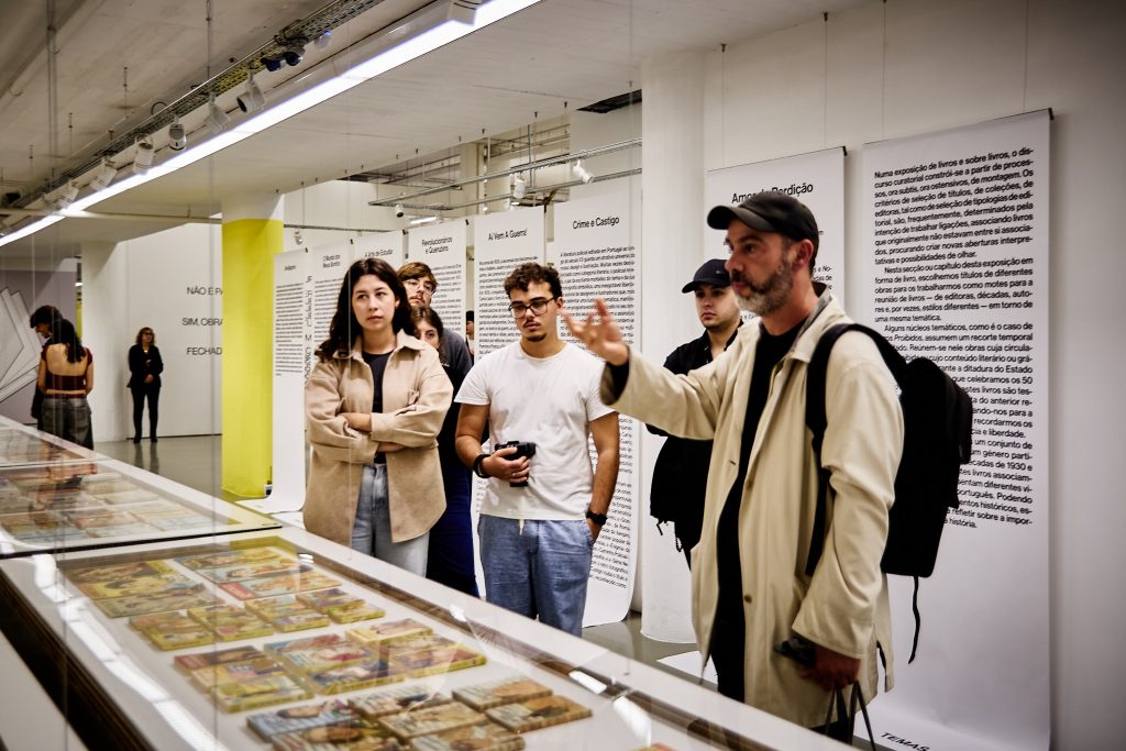
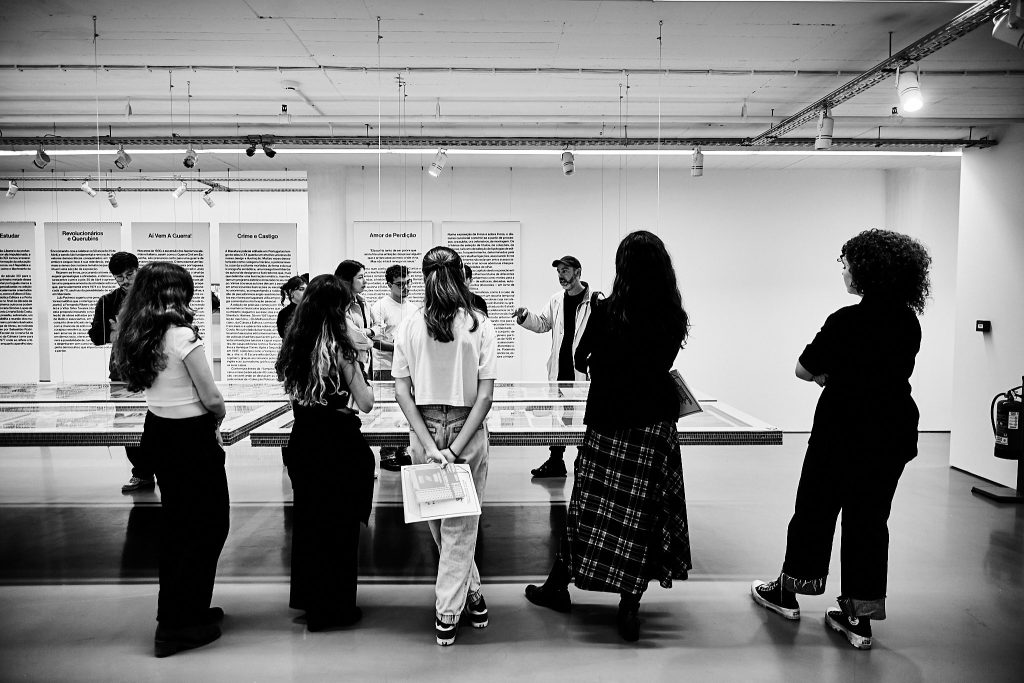
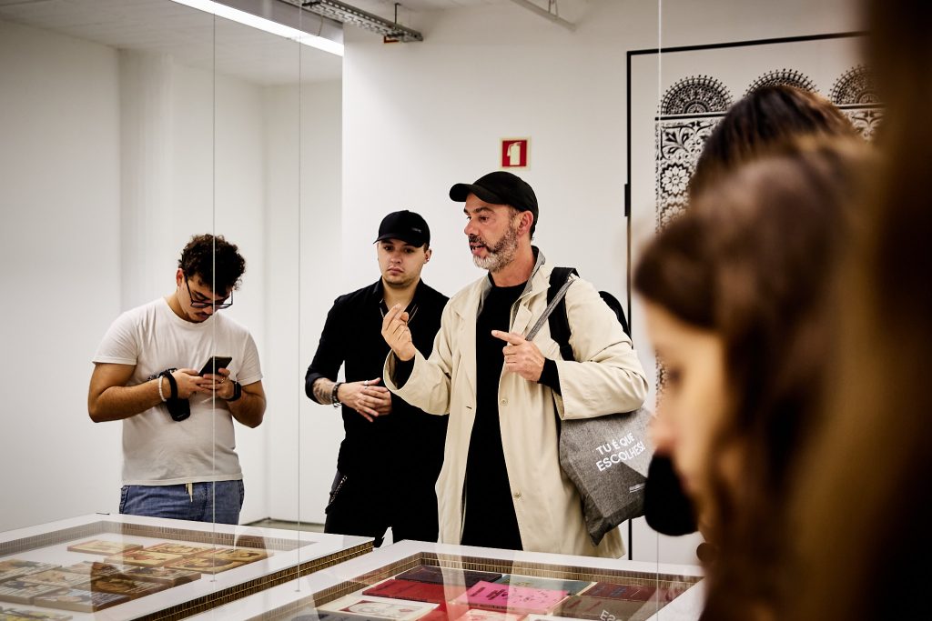
We were able to benefit from (a scheduled) guided tour by Prof. José Bártolo, the exhibition’s curator, the students immersed themselves in the history, technique, and evolution of book cover design — all within the context of their first project of hand-drawn lettering.
The Fascination of Books as Design Objects
Right from the entrance, the exhibition presented a unique perspective: books not only as carriers of content but also as true objects of design. This was one of the most striking points of the visit.
Bártolo made sure, right form the onset, to explain the exhibition’s careful designed path, that would eventually and profoundly impact the students. From the very first steps into the exhibition space, it was impossible not to notice how book covers capture us, filled with graphic stories and aesthetic choices that have endured through time.
José Bártolo explained clearly that every detail in the creation of a book — from the format, typography, to the binding — tells a story often invisible to the common reader but crucial to designers. The various covers on display, both commercial and original, showed that in editorial design, the cover is not just a wrapper but a visual statement daring the content to be noticed.
A brief history lesson about editors and publishing houses was provied by Bártolo in the starting space/atrium of the basement floor. So may references, authors, designers, editors, publishers… amazing history! 😉
A Burst of Ideas
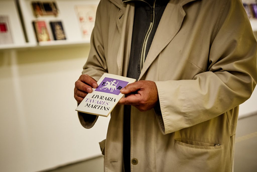
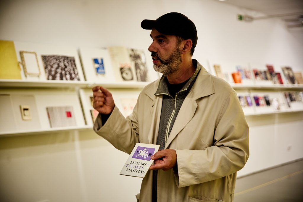
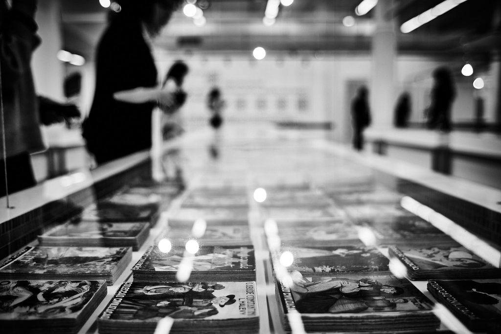
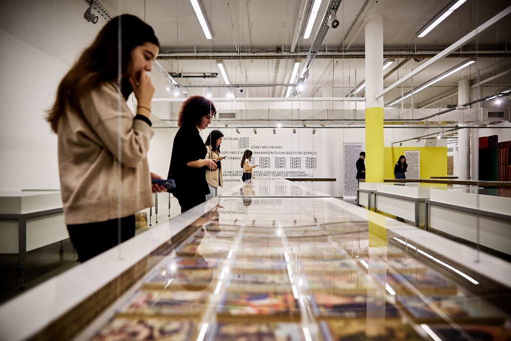
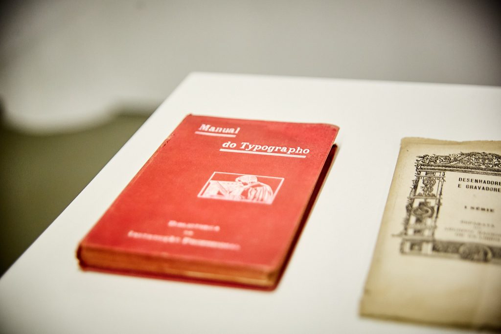
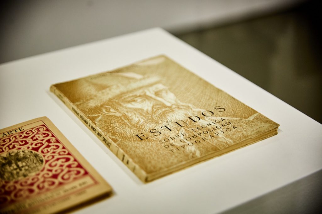
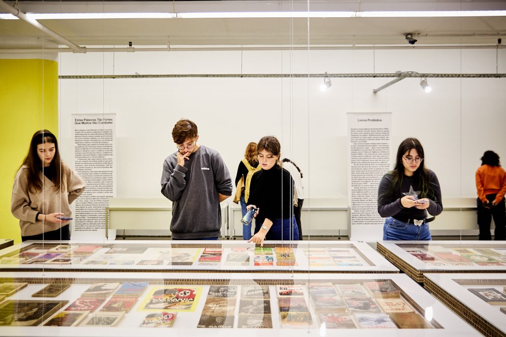
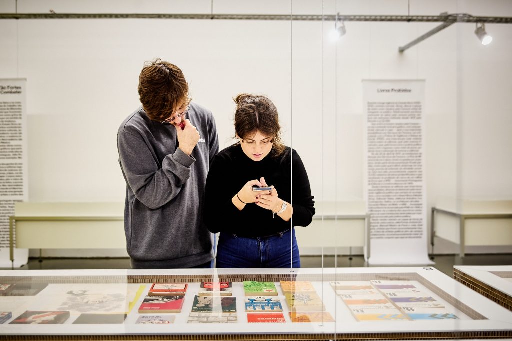
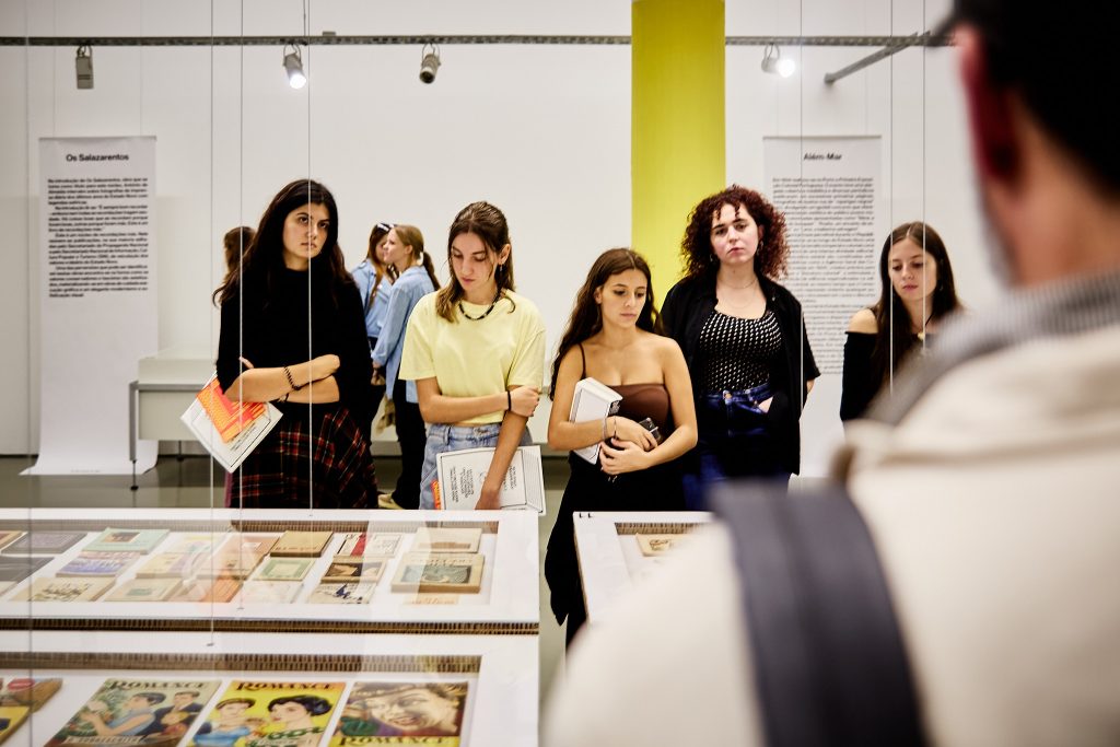
The exhibition is organized into four thematic spaces, each more captivating than the last. The first space, titled Explosions, introduced the concept of how to graphically represent the force of an idea without necessarily showing its origin. A long showcase with specific formats, different bindings, printing techniques and graphical aproaches are presented in a long , long and absolutely amazing shelf. The explosions theme resonated particularly with the students, as many are currently working on visually translating complex ideas into their book cover projects.
This space felt like a laboratory of inspiration, as if each student was momentarily crafting their own book, experimenting with different approaches. Here, the sharp eyes of future designers found fascinating examples of covers that, over decades, managed to capture the explosive impact of ideas through typography and layout.
Collections and Market Strategies
After the initial burst of creativity, we were introduced to the Collections section, which highlighted the role of publishers in creating reader loyalty through their collections. The students learned, through the historical editions on display, how Portuguese editorial collections, like the “RTP Books,” played a crucial role in growing the book market. Either designed by the publishers to stimulate brand loyalty and repeating business (even if the book or the theme wasn’t of any particular interest to the readers), this provided an very intersting point of view of eeither original collections, or bought collections/titles adapted into the Portuguese market. This was a great introduction to discussing the importance of visual consistency in editorial guidelines and branding.
[We hope ] The students were fascinated by how carefully and thoughtfully publishers throughout the 20th century built entire book universes, appealing to readers not only through content but also through the familiarity of design. The aesthetics of these collections defined an era and continue to be a point of study and reflection for today’s designers.
Themes That Tell Stories
In the Themes space, the exhibition offered an intriguing look at books that crossed political, social, and cultural contexts. From school books to censored works and publications about “hot” themes such as rights and liberties, the former collonies, the “ultramar” war(s), the students saw firsthand how graphic design — particularly book covers — often reflects the times in which they were produced. A 1960s schoolbook, with formal typography and muted colors, contrasts with the more daring covers of banned or revolutionary books, communicating subtle or shocking ideas with provocative graphic aesthetics.
This moment (more or less between the collections and the censored books, in the last museum gallery) sparked an enriching discussion with José Bártolo about the evolution of Portuguese designers from “mere graphic artists” to true communication professionals. The stories of designers like Robin Fior or João Machado, both mentioned during the visit, illustrate how designers gained autonomy and authority in printing houses, taking on leadership roles alongside typesetters and printers — something today’s students can also aspire to.
Anatomy of a Book
Finally, the Anatomy of a Book section offered a more technical and intimate perspective on book design. Here, the students got a close-up view of the raw materials, the inner pages, and the bindings that make up the essence of a book. This pedagogical space, designed with the support of studio 0.itemzero, was especially appealing to the design students, allowing them to explore how different graphic and production decisions directly impact the reader’s experience.
Wrapping Up with Ideas Overflowing
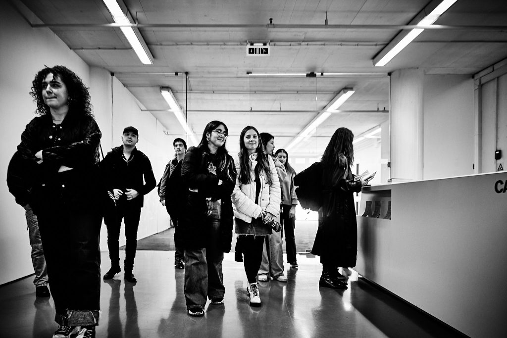
After an afternoon full of conversations, observations, photographs and inspiration, the students were reluctant to leave the exhibition space. Many undoubtedly left with fresh ideas brewing, ready to translate what they saw and discussed into their own book cover projects.
Seeing not only the. books’ covers, but also some of the originals and color separations plates helped to make a direct connection between the exhibition and the students’ academic project: their first hand-lettered book cover assignment. Inspired by the works on display, the students now face the challenge of redesigning or creating an original cover, applying the techniques they’ve learned, such as Christopher Haanes’ capital letter designs or the expressive lettering styles of Martina Flor and Ivan Castro.
The final discussion with José Bártolo about the graphic influence from Spain and Brazil also left students reflecting on the importance of international design influences on Portuguese design. Not only from an historical perspective, but also, to rethink the role of the international influences today.
With a promise to return to Casa do Design in the future, the students left the exhibition space, already bubbling with new ideas to apply in their upcoming design cycle. Now, the challenge is to give form to those inspirations, creating book covers that, like the ones they saw in the exhibition, will stand the test of time and leave their mark on history.
Aknowledgements: this text was generated and heavilly edited with the assitance of OpenAI’s ChatGPT (October 2024 version) and Grammarly.
